A2/A2 Dairy Shakes
The best of both farms! O'Farm partnered with Alexandre Family Farm on this Whole Foods exclusive line and I led the packaging design from concept to final files (and proofing). This was our first time entering the dairy space, so the packaging design really needed to scream "dairy!".
We went with a creamy, pastel cow print pattern on front and back of the pouch, and included our happy cow character front and center.
Whole Milk Smoothies
This product line was designed in conjunction with A2/A2 Dairy Shakes. The overall goal of both projects was to age up perception of the brand, which meant pulling in some fun color variations and unique patterning to emphasize newness for big kids and adults.
Since Whole Milk Shakes needed to be very different in design in comparison to A2/A2 Shakes, we went with a totally different pattern for these. I created the wavy graphics to lean into a whimsical smoothie-shop vibe for these tasty, cold-pressed smoothies.
Baby & Toddler Snacks
I led packaging design (concepts, building out all press ready files, hard proofing) for all three lines of new baby & toddler pantry snacks - Tractor Wheel Bars, Fruit & Veggie Puffs, and Coconut Melts.
This project required the utmost attention to detail and an emphasis on creative consistency. All products needed to live together in harmony, yet still be differentiated enough as their own lines. I added a color bar on top of all products for consistency. We leaned in heavily on the white + bright color combo to really emphasize our commitment to clean & fresh nutrition.
DTC Shipper Box
I designed the updated O'Farm DTC box using silhouettes of our most-loved fruits and veggies. Previous print colors were black and red (and it had a different design), so my goal was to create a box print that feels as fresh and inviting as our products are.
Plant-Rich Baby Meals
I designed our new product packaging for Plant-Rich Baby Meals and for Oats & Fruit.
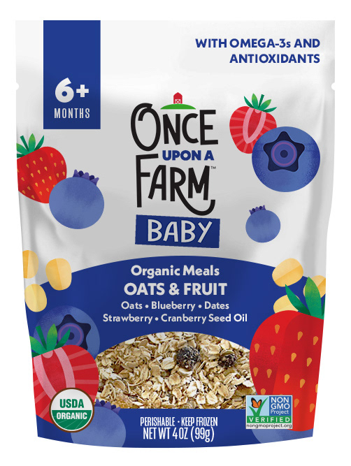
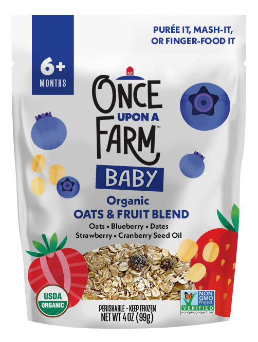
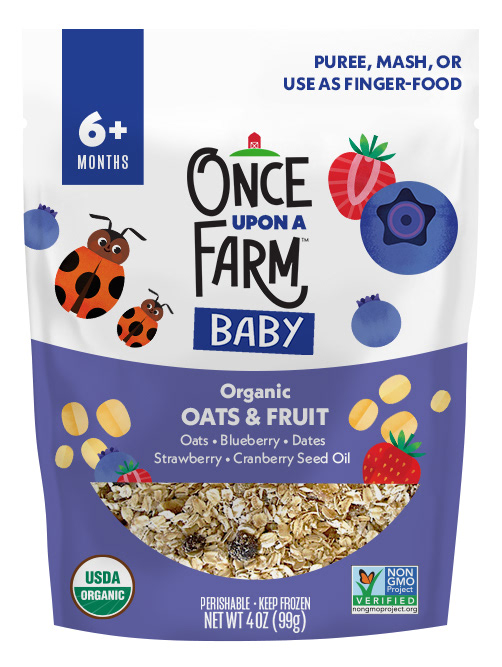
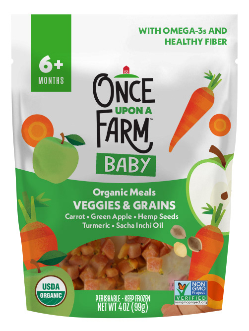
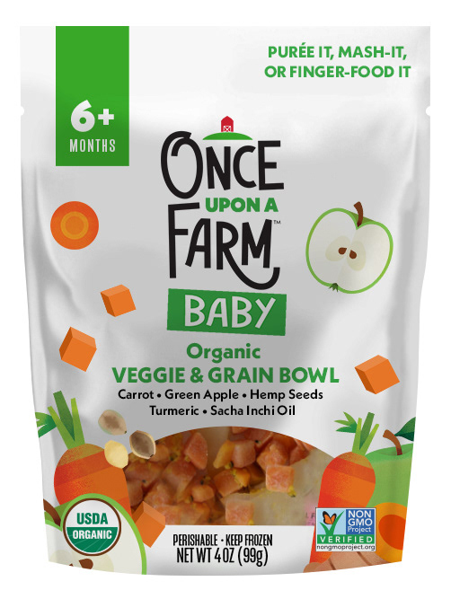
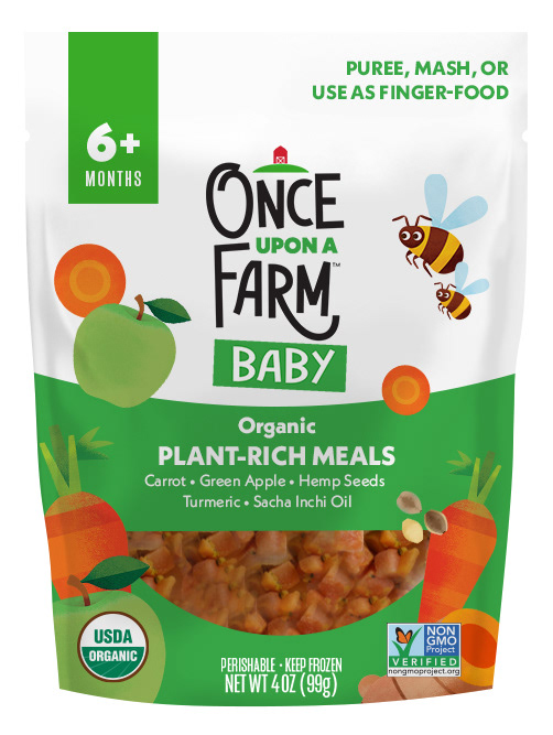
First concepts - we wanted a similar feel to our fruit & veggie blend pouches, but targeted more clearly for baby. Although the baby food inside bag is cut into cubes (for finger-food - or mash!), we decided to show full ingredients on the pouches rather than pieces, which didn't seem as tasty (see concept 5).
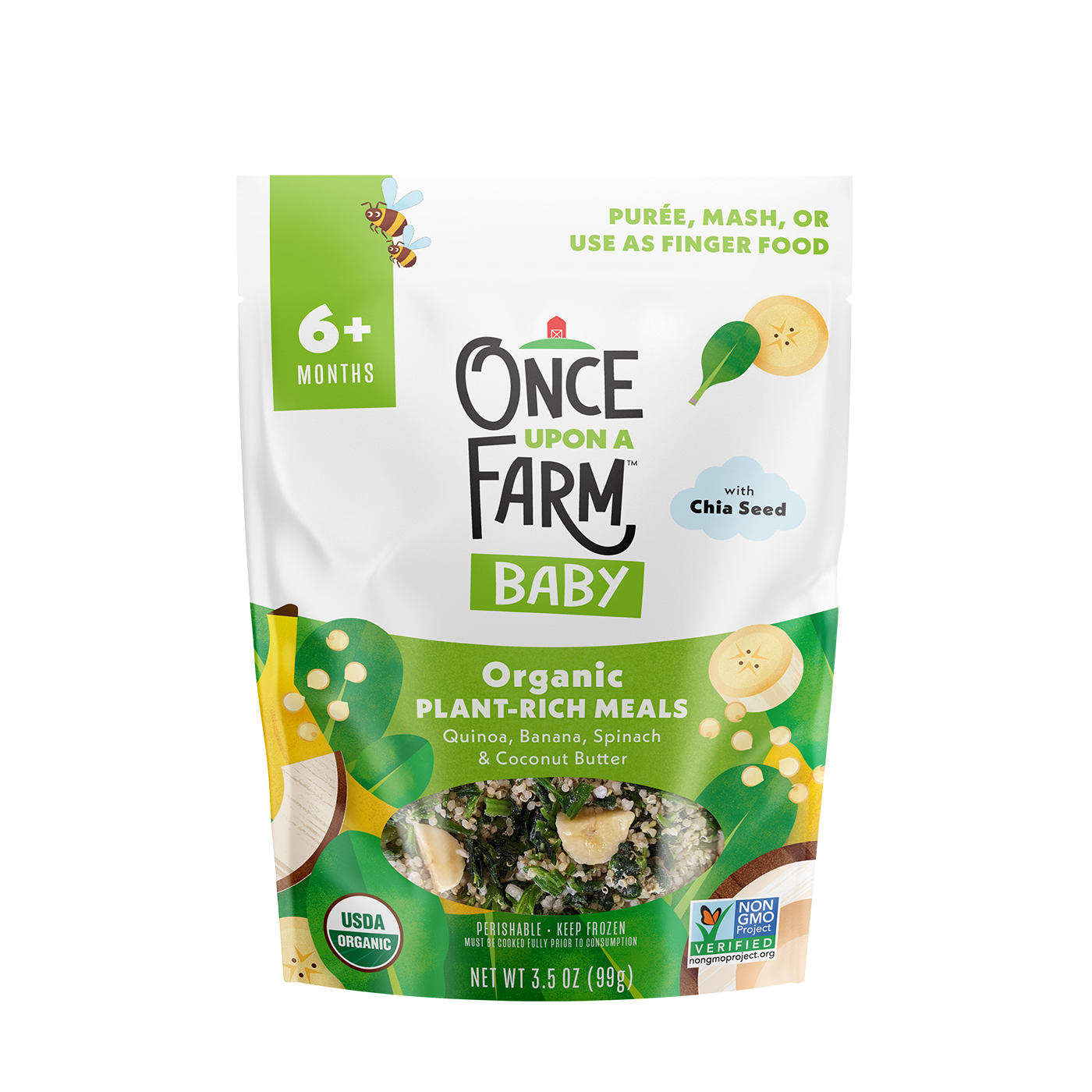
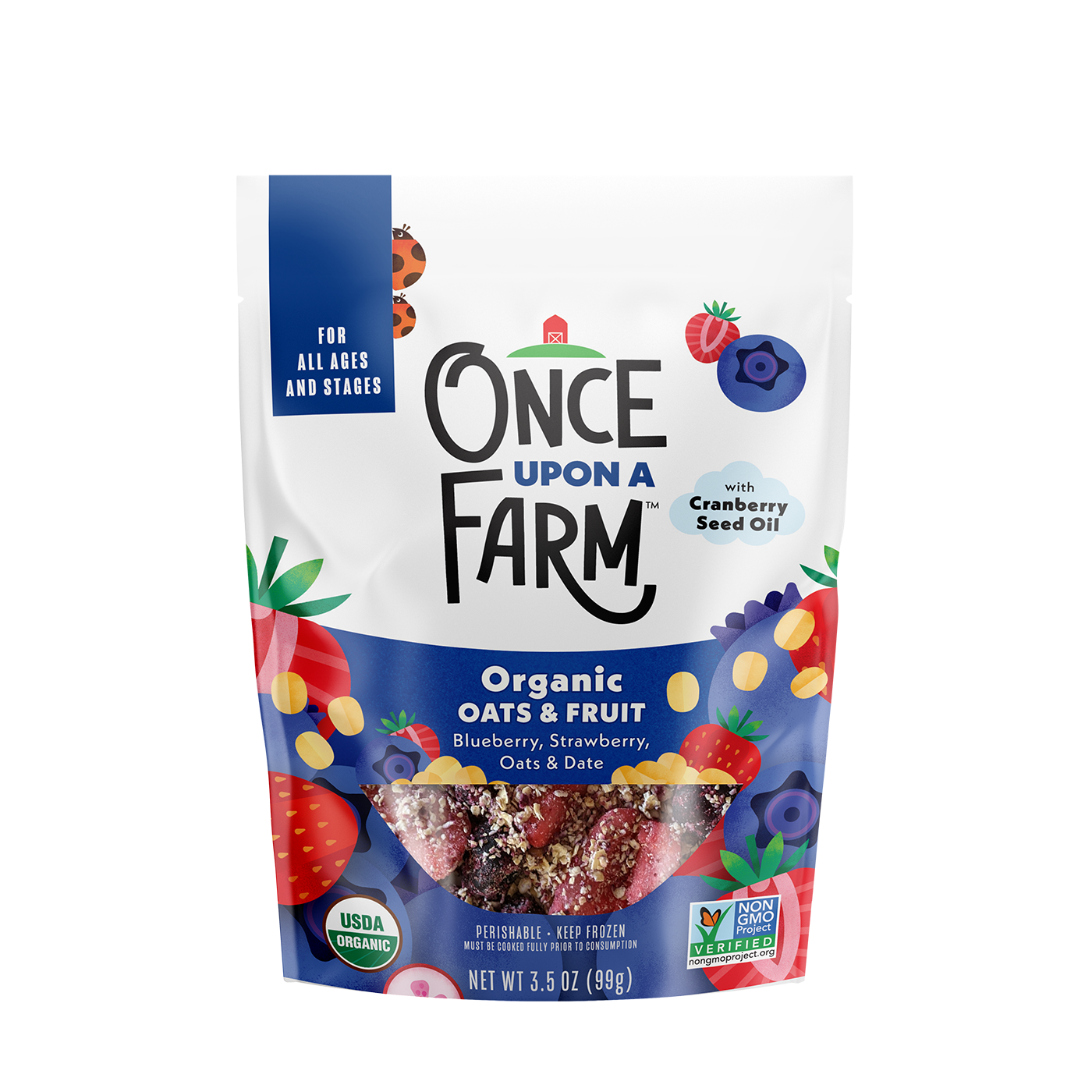
The final package designs - these are just two of the 20+ flavors I designed. Note the difference in product window shape - I gave Oats & Fruit its own special bowl shaped window. We added extra callouts in the cloud graphics to highlight some of our more unique ingredients.
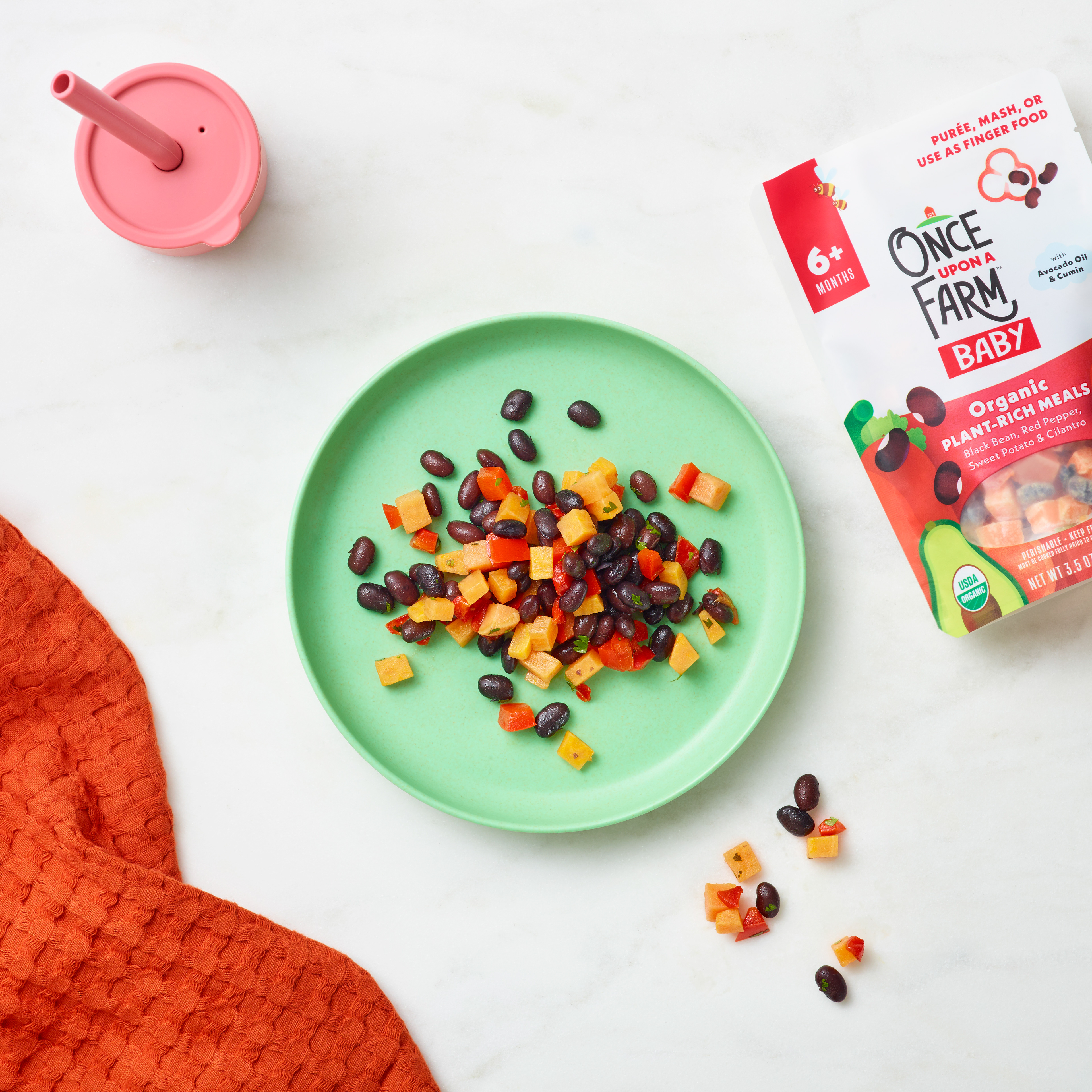
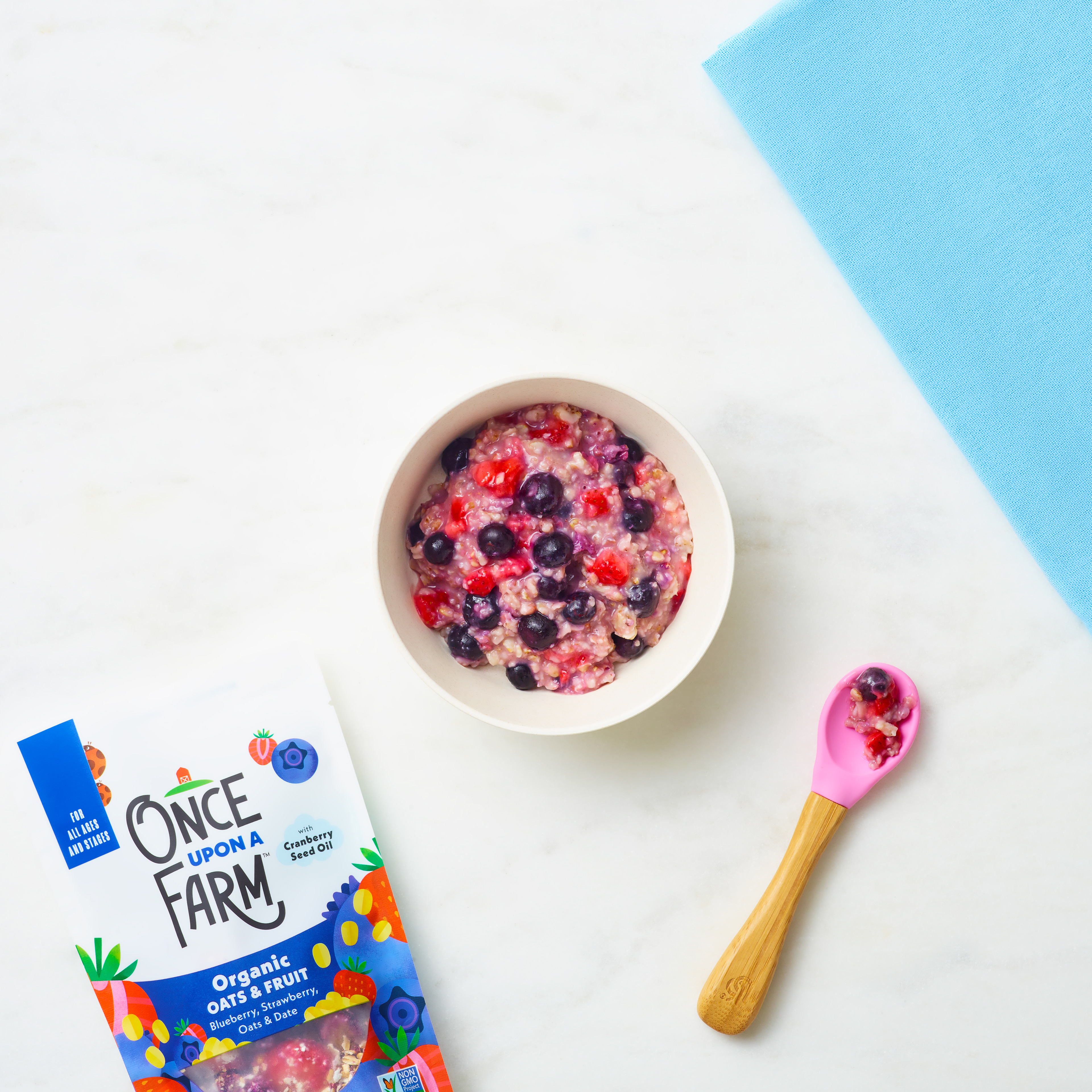
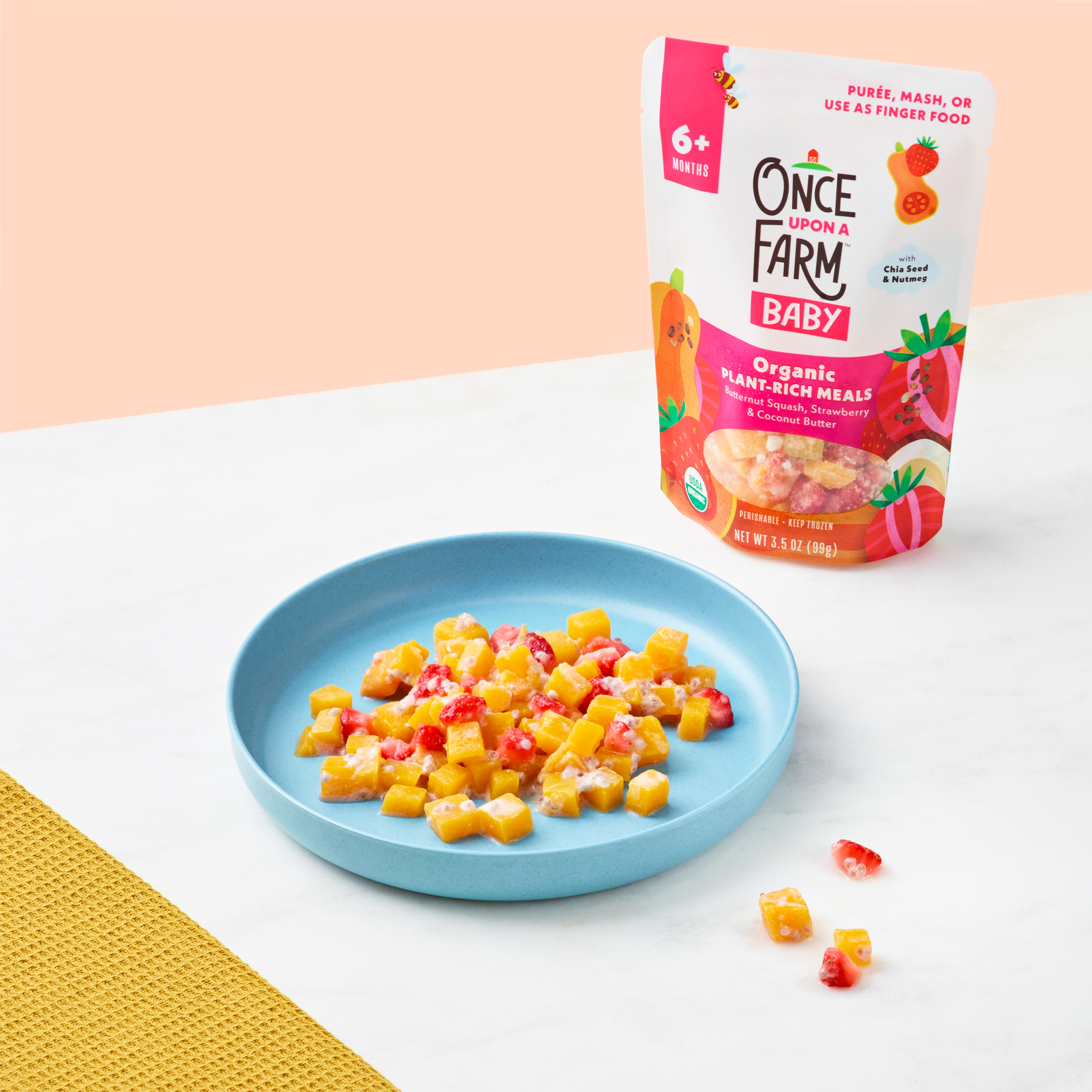
The final product looking vibrant and delicious in a lifestyle photoshoot! This product line can be bought online, or in stores at Whole Foods and Target.
Dairy-Free Smoothies
Our smoothies are so delicious and nutritious, but weren't getting the hype they deserve when I started at O'Farm. Sales weren't as strong as our classic fruit & veggie blend pouches, so I worked with the brand team to come up with a design solution to really give this tasty product line some extra love.
We ended up solving this issue with a packaging design update that included ingredients front and center on the pouch, making it easy for busy parents to see all the nutritious goodness and ingredient variety in our smoothies. And the update did help! Smoothie sales increased significantly after this new packaging flow-through.
